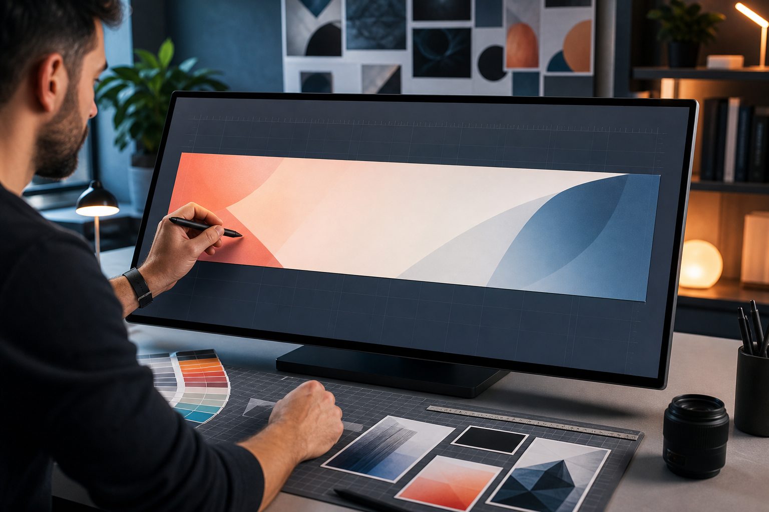
Learning how to make a youtube banner is one of the easiest ways to make your channel look more professional, trustworthy, and memorable. Your banner is the wide image at the top of your channel page, and it often gives visitors their first impression before they watch a video or read your description. A strong banner explains what your channel is about, supports your brand style, and helps viewers quickly decide whether your content matches their interests. The good news is that you do not need to be a professional designer to create one. With the right size, layout, colors, text, and export settings, you can design a YouTube banner that looks clear on phones, tablets, desktops, and TVs. In this guide, you will learn the purpose of a banner, the correct dimensions, the design process, practical examples, common mistakes, best practices, and answers to frequent questions.
What A YouTube Banner Does
A YouTube banner is more than decoration. It works like a visual welcome sign for your channel and helps viewers understand your content in seconds.
1. Shows Your Channel Topic
Your banner should make the channel topic obvious without forcing visitors to guess. A cooking channel might use food photography, a gaming channel might use bold graphics, and an education channel might use clean text and icons. Clear visual signals help the right audience stay longer.
2. Builds A Consistent Brand
A banner connects your channel art with your thumbnails, profile image, video style, and overall tone. When your colors, fonts, and design choices feel consistent, viewers remember your channel more easily. This consistency also makes your page look planned instead of random.
3. Communicates Your Value
The best banners quickly answer why someone should subscribe or keep watching. You might mention your niche, upload schedule, or main promise in a short phrase. Keep this message simple, because viewers often scan your banner for only a few seconds.
4. Creates A Strong First Impression
Before someone watches your latest upload, your banner can shape their opinion of your channel quality. A blurry, crowded, or outdated banner may make the channel feel neglected. A polished banner suggests that your videos are also created with care.
5. Supports Channel Recognition
Recognition matters when viewers see your content across search, suggested videos, and your channel page. A familiar color palette, logo placement, or design style helps people connect your banner with your videos. This makes your channel easier to remember over time.
6. Guides Viewer Expectations
Your banner can set expectations about your content format, personality, and audience. A minimalist banner may suggest professional tutorials, while a bright energetic banner may suggest entertainment or lifestyle content. Matching expectations helps attract viewers who enjoy your actual videos.
YouTube Banner Size And Safe Area
Correct sizing is one of the most important parts of making a YouTube banner because the image appears differently across devices.
1. Use The Recommended Canvas Size
The commonly recommended YouTube banner size is 2560 by 1440 pixels. This large canvas gives enough room for TV displays while still allowing YouTube to crop the image for smaller screens. Starting with this size helps prevent stretching, softness, and awkward resizing.
2. Keep Key Content In The Safe Area
The most important text, logo, and faces should sit in the central safe area, which is the part most likely to appear across devices. If you place important information near the edges, it may disappear on phones or desktops after YouTube crops the banner.
3. Design For Mobile First
Many viewers visit YouTube channels on mobile devices, so your banner must remain readable on small screens. Use short text, simple shapes, and strong contrast. If your banner only looks good on a large monitor, it may fail where most people see it.
4. Avoid Edge-Heavy Layouts
Decorative background elements can extend toward the edges, but essential information should not. Place patterns, textures, or supporting visuals outside the safe area only when they can be cropped without harm. This approach keeps the banner flexible across screen sizes.
5. Check File Size And Format
Export your banner in a common image format such as PNG or JPG, depending on the design. PNG is useful for crisp text and graphics, while JPG can work well for photo-heavy banners. Keep the file clean and not overly compressed.
6. Preview Before Publishing
After uploading, preview the banner on more than one device if possible. Look for cropped text, tiny lettering, poor contrast, or awkward spacing. A quick review helps you catch problems before visitors see an unfinished or hard-to-read design.
How To Make A YouTube Banner Step By Step
This simple process helps you move from a blank canvas to a finished channel banner with fewer design mistakes.
- Define Your Channel Message: Decide what viewers should know immediately, such as your niche, promise, or posting theme.
- Choose The Correct Size: Start with a 2560 by 1440 pixel canvas so the banner has enough resolution for all devices.
- Mark The Safe Area: Keep your logo, channel name, tagline, and important visuals centered where they will not be cropped.
- Select Brand Colors: Pick two or three colors that match your channel personality and can also work in thumbnails.
- Add Simple Text: Use a short phrase instead of a long sentence, and make sure it remains readable on mobile screens.
- Place Visual Elements: Add photos, shapes, icons, or graphics that support the channel topic without crowding the design.
- Export And Upload: Save the banner clearly, upload it to your channel, and preview the final result across devices.
Key YouTube Banner Design Elements
A good YouTube banner combines several design choices that work together instead of competing for attention.
- Readable Text: Use large, clear lettering that can be understood quickly, especially on mobile screens.
- Strong Contrast: Make sure text stands out from the background so viewers do not struggle to read it.
- Relevant Imagery: Choose visuals that match your niche, such as tools, products, people, locations, or topic-related graphics.
- Simple Layout: Leave enough empty space so the banner feels organized and easy to scan.
- Consistent Branding: Match your banner style with your thumbnails, profile picture, and channel tone.
- Clear Focus: Give viewers one main idea instead of filling the banner with too many messages.
Best Practices For Making A YouTube Banner
These best practices help your banner look professional while still being easy to create and update.
1. Keep The Message Short
A banner is not the place for a long paragraph or full channel description. Use a brief phrase that communicates your niche or value. Short text is easier to read, easier to remember, and more likely to survive cropping on different screens.
2. Use One Main Visual Focus
Choose one clear focal point, such as your face, product, logo, or central graphic. Too many competing elements can make the banner feel noisy. A single focus helps viewers process the design quickly and understand what matters most.
3. Match Your Thumbnail Style
Your banner should feel connected to your video thumbnails, even if it does not look identical. Repeating colors, fonts, or visual tone creates a stronger brand. When everything looks related, your channel page feels more intentional and trustworthy.
4. Make Text Mobile Friendly
Text that looks large on a desktop may become tiny on a phone. Use fewer words, heavier font weights, and strong contrast. Before publishing, zoom out or preview on a small screen to make sure your message remains clear.
5. Update It When Your Channel Changes
If your niche, schedule, offer, or visual identity changes, your banner should change too. An outdated banner can confuse viewers and make your channel feel inactive. Review it every few months to confirm it still matches your current content.
6. Leave Breathing Room
Empty space is not wasted space. It helps important elements stand out and makes the design feel cleaner. Avoid filling every corner with text, stickers, icons, or photos. A calmer layout often looks more professional than a crowded one.
Common YouTube Banner Mistakes To Avoid
Small design errors can make a banner look less professional, especially when the image is cropped or viewed on mobile.
1. Using Too Much Text
Long sentences are hard to read in a banner because viewers scan quickly and screen sizes vary. Instead of listing every topic you cover, choose one short message. Your videos, playlists, and channel description can provide the deeper details.
2. Ignoring The Safe Area
Many beginners design the full canvas and forget that YouTube crops banners differently. This can cut off names, logos, or taglines. Always keep important information centered and treat the outer areas as flexible background space.
3. Choosing Low Quality Images
A pixelated photo or stretched graphic can make the whole channel look careless. Use sharp visuals and avoid enlarging small images beyond their quality. If your banner includes a portrait or product, it should appear crisp and properly lit.
4. Mixing Too Many Fonts
Using several fonts can make a banner feel messy and harder to read. Stick to one or two font styles that fit your brand. A clean type choice usually looks more confident than a design filled with decorative lettering.
5. Forgetting Brand Consistency
If your banner has one style and your thumbnails have another, viewers may not connect them as part of the same channel. Use recurring colors, shapes, or text treatments. Consistency helps your channel feel organized and easier to recognize.
6. Making The Design Too Trendy
Trendy effects can look exciting at first but may become outdated quickly. Use trends carefully and keep the core design simple. A timeless banner is easier to maintain and will not need constant redesigns just to stay presentable.
Examples Of YouTube Banner Ideas
Looking at banner ideas by channel type can help you choose a layout that fits your audience and content style.
1. Education Channel Banner
An education channel can use a clean background, a clear topic phrase, and simple icons related to learning. The design should feel trustworthy and organized. Avoid clutter, because viewers looking for tutorials or lessons usually value clarity and structure.
2. Gaming Channel Banner
A gaming banner can use bold colors, dramatic lighting, character-style graphics, or energetic typography. The main challenge is keeping it readable. Even if the style is intense, the channel name and core message should remain easy to see.
3. Fitness Channel Banner
A fitness banner might include an action photo, strong contrast, and a short promise such as workouts, strength, or healthy routines. The design should feel active without being overcrowded. It should also match the fitness level and audience you serve.
4. Beauty Channel Banner
A beauty channel banner often works well with polished photography, soft but readable colors, and elegant typography. It can highlight makeup, skincare, hair, or lifestyle themes. The best version feels stylish while still making the channel topic obvious.
5. Business Channel Banner
A business or finance channel should usually look sharp, credible, and calm. Clean lines, neutral colors, and a direct value statement can work well. Avoid gimmicky graphics if your audience expects practical advice, strategy, or professional insight.
6. Travel Channel Banner
A travel banner can use a strong destination image, map-inspired details, or a simple phrase about exploration. The image should feel specific rather than generic. Viewers should immediately sense the type of travel content they will find on the channel.
Advanced YouTube Banner Tips
Once the basics are in place, these tips can make your banner feel more polished and more connected to your channel strategy.
1. Design Around Viewer Intent
Think about why people visit your channel page. Some want tutorials, some want entertainment, and others want proof that you are credible. Your banner should answer that intent visually, so the design supports the viewer’s reason for being there.
2. Use A Visual Hierarchy
Visual hierarchy means the most important element is noticed first, followed by supporting details. You can create it with size, contrast, placement, and spacing. Without hierarchy, everything competes equally, and viewers may miss the message entirely.
3. Include Your Upload Theme Carefully
If you have a reliable upload schedule or series format, you can include it in the banner. Keep it short and update it when needed. Never promise a schedule you cannot maintain, because that can create disappointment for returning viewers.
4. Test More Than One Version
If you are unsure which design works best, create two or three versions and compare them on different devices. Look for readability, emotional fit, and brand consistency. Sometimes a simpler version performs better because it communicates faster.
5. Use Faces With Purpose
If you are the face of the channel, including your portrait can build recognition and trust. Use a clear image with good lighting and natural expression. Place the face so it supports the message instead of covering important text.
6. Keep Editable Source Files
Save your editable design file so future updates are easy. You may need to change a tagline, color, image, or schedule later. Keeping the source file prevents you from rebuilding the banner from scratch every time your channel evolves.
Practical YouTube Banner Use Cases
Different creators need different banner strategies, so the right design depends on how the channel earns attention and trust.
1. New Channels Building Trust
A new channel should use a banner to quickly explain the niche and look credible. Since viewers do not know you yet, clarity matters more than cleverness. A simple promise, consistent style, and clean layout can reduce hesitation.
2. Personal Brands Growing Recognition
For personal brands, the banner can highlight the creator’s face, name, and area of expertise. This helps viewers connect the person with the content. The design should feel authentic and aligned with how the creator appears in videos.
3. Businesses Promoting Expertise
A business channel can use the banner to show authority, services, or the type of problems it solves. The tone should match the audience, whether formal, friendly, technical, or creative. Clear positioning matters more than decorative design effects.
4. Creators Launching A New Series
If a channel is promoting a new series, the banner can temporarily feature that theme. This works well when the series is central to the channel for a period of time. Just remember to update the banner when the campaign ends.
5. Niche Channels Attracting Specific Viewers
Niche channels benefit from banners that speak directly to the right audience. A woodworking channel, language channel, or software channel should show topic-specific cues. Specificity helps attract interested viewers and filters out people who are unlikely to subscribe.
6. Established Channels Refreshing Their Look
An established channel may redesign its banner to match improved production quality or a refined niche. The update should keep recognizable brand elements where possible. A refresh works best when it feels like growth rather than a complete identity disconnect.
YouTube Banner Checklist
Use this checklist before publishing your banner to catch the most common quality issues.
- Correct Size: Confirm the canvas is large enough for YouTube’s display requirements and does not look stretched.
- Safe Area: Check that your channel name, tagline, and key visuals stay centered and visible.
- Readable Text: Make sure words are short, clear, and readable on a small mobile screen.
- Brand Match: Compare the banner with your thumbnails and profile image for a consistent look.
- Clean Export: Save the file in a suitable image format without heavy compression or visible blur.
- Device Preview: Review the uploaded banner on mobile and desktop before treating it as finished.
Future Trends In YouTube Banner Design
YouTube channel design changes as viewer habits, creator tools, and visual trends evolve, so banners should stay flexible.
1. Simpler Brand Systems
Creators are moving toward cleaner brand systems that work across banners, thumbnails, shorts, and social profiles. Instead of complex artwork, many channels use strong colors, clear type, and repeatable layouts. This makes branding easier to maintain.
2. More Mobile Focused Layouts
As mobile viewing remains important, banner designs will continue to prioritize center-safe layouts and short messaging. Tiny text and detailed edge graphics are less useful. The strongest banners will be those that remain clear in smaller viewing contexts.
3. Creator Faces As Brand Assets
For personality-led channels, the creator’s face will remain a powerful recognition tool. High-quality portraits, consistent expressions, and intentional placement can make banners feel more human. This works especially well when the creator appears regularly in videos.
4. Niche Specific Visual Signals
Generic banners are becoming easier to ignore. More creators will use niche-specific details that instantly show what the channel covers. These signals might include tools, locations, interface elements, products, or visual references familiar to the target audience.
5. Faster Seasonal Refreshes
Some channels will update banners for launches, seasons, challenges, or major content shifts. These updates can keep the channel page fresh, but they still need brand consistency. A good template makes seasonal changes quicker and less risky.
6. Better Template Customization
Design tools are making templates easier to customize, which helps beginners create polished banners faster. The risk is that many channels may look similar. Creators who personalize colors, images, spacing, and copy will stand out more.
Frequently Asked Questions
1. What Is The Best Size For A YouTube Banner?
The best starting size for a YouTube banner is 2560 by 1440 pixels. This gives enough resolution for large displays while allowing YouTube to crop the image for smaller screens. Keep important text and logos in the center safe area.
2. Can I Make A YouTube Banner Without Design Experience?
Yes, you can make a YouTube banner without design experience by using a simple layout, readable text, and consistent colors. Start with the correct size, keep the message short, and avoid crowding the design with too many elements.
3. What Should I Put On My YouTube Banner?
Your banner should include your channel name or brand, a short description of your content, and visuals that match your niche. You can also include an upload schedule if it is reliable. Keep everything clear, centered, and easy to read.
4. Why Does My YouTube Banner Look Cropped?
Your banner looks cropped because YouTube displays the same image differently on phones, tablets, desktops, and TVs. This is normal. To prevent problems, place important text and graphics in the central safe area and use the edges mainly for background design.
5. Should My Banner Match My Thumbnails?
Your banner does not need to copy your thumbnails exactly, but it should feel related. Using similar colors, fonts, or design style helps viewers recognize your brand. A consistent look makes your channel page feel more polished and intentional.
6. How Often Should I Update My YouTube Banner?
Update your banner whenever your channel topic, branding, upload schedule, or main message changes. You do not need to redesign it constantly, but reviewing it every few months helps ensure it still represents your current content and audience clearly.
Conclusion
Making a YouTube banner is about combining clear communication with practical design choices. Start with the right size, protect the safe area, use readable text, choose relevant visuals, and keep your layout simple. A strong banner helps viewers understand your channel quickly.
The best banner is not always the most complicated one. It is the one that fits your audience, matches your content, and looks clear on every device. When your banner supports your channel identity, it becomes a useful part of your overall YouTube presence.